Dear Data
This project started when I saw the headline: “Dear Data and FiveThirtyEight Want You To Visualize Your Podcast Habits.” As a designer and avid podcast listener, I was intrigued!
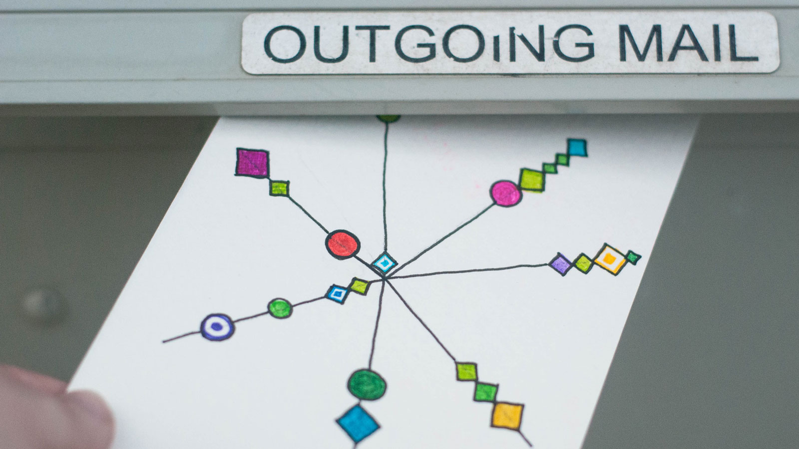
Reading on, I learned about the Dear Data project, in which Giorgia Lupi and Stefanie Posavec picked something to measure each week, then mailed each other a postcard with a visualization of that data. The data covered a broad range of topics, from things like tabulating the animals they saw or clothes they wore, to mapping their emotions and distractions. The front of the postcard shows the way they visualized their data (always hand-drawn), and the back of the postcard serves as a “legend” to help the recipient decode the data. Looking through the backlog of postcards, it’s fun to see Giorgia and Stefanie’s unique drawing styles, and the whimsical, unexpected ways that they put the data together. Now that the postcard project is complete, a Dear Data Book is being published in September of 2016.
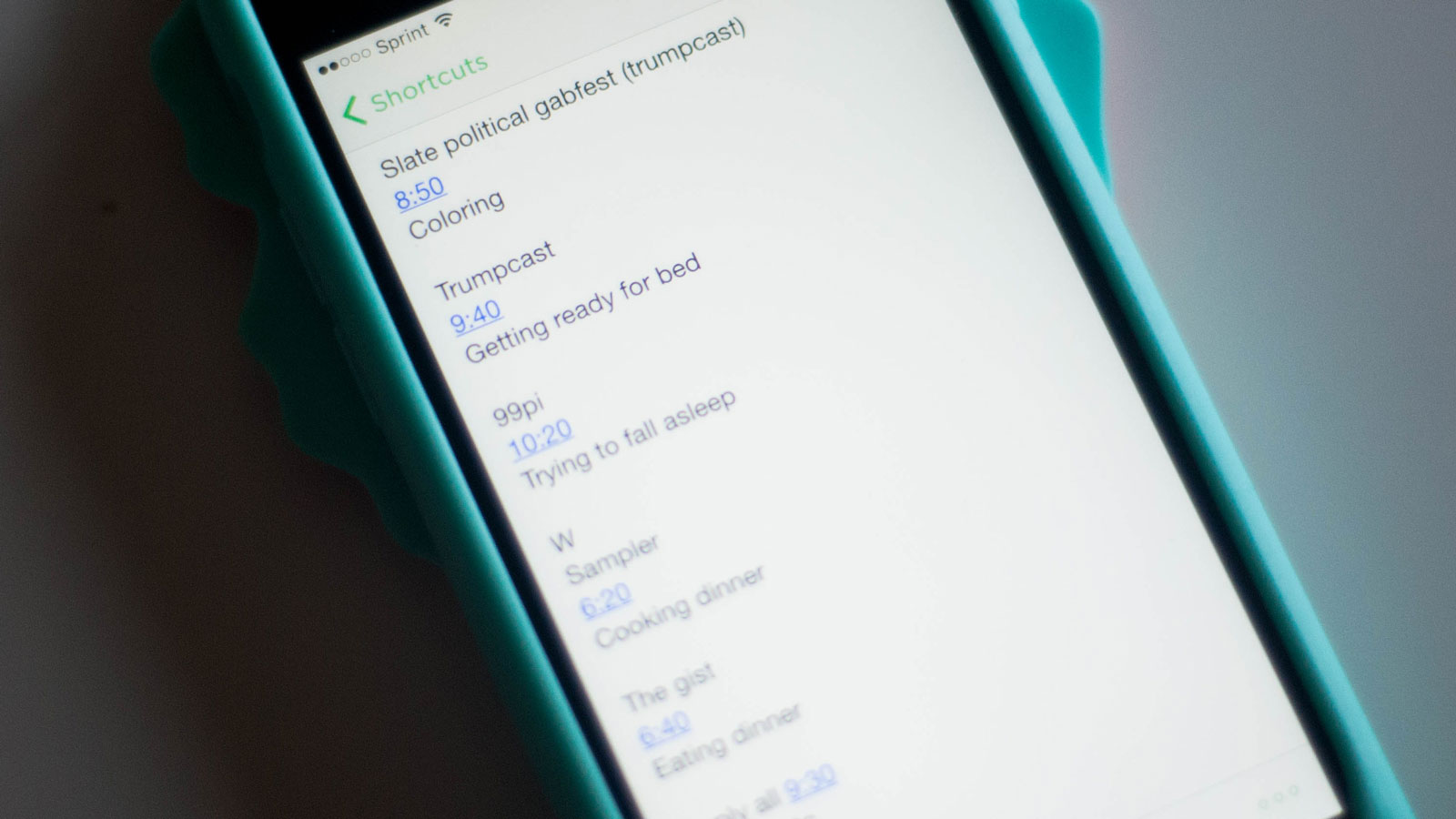
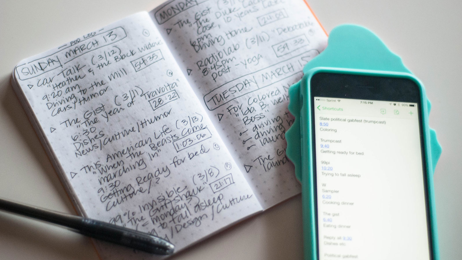
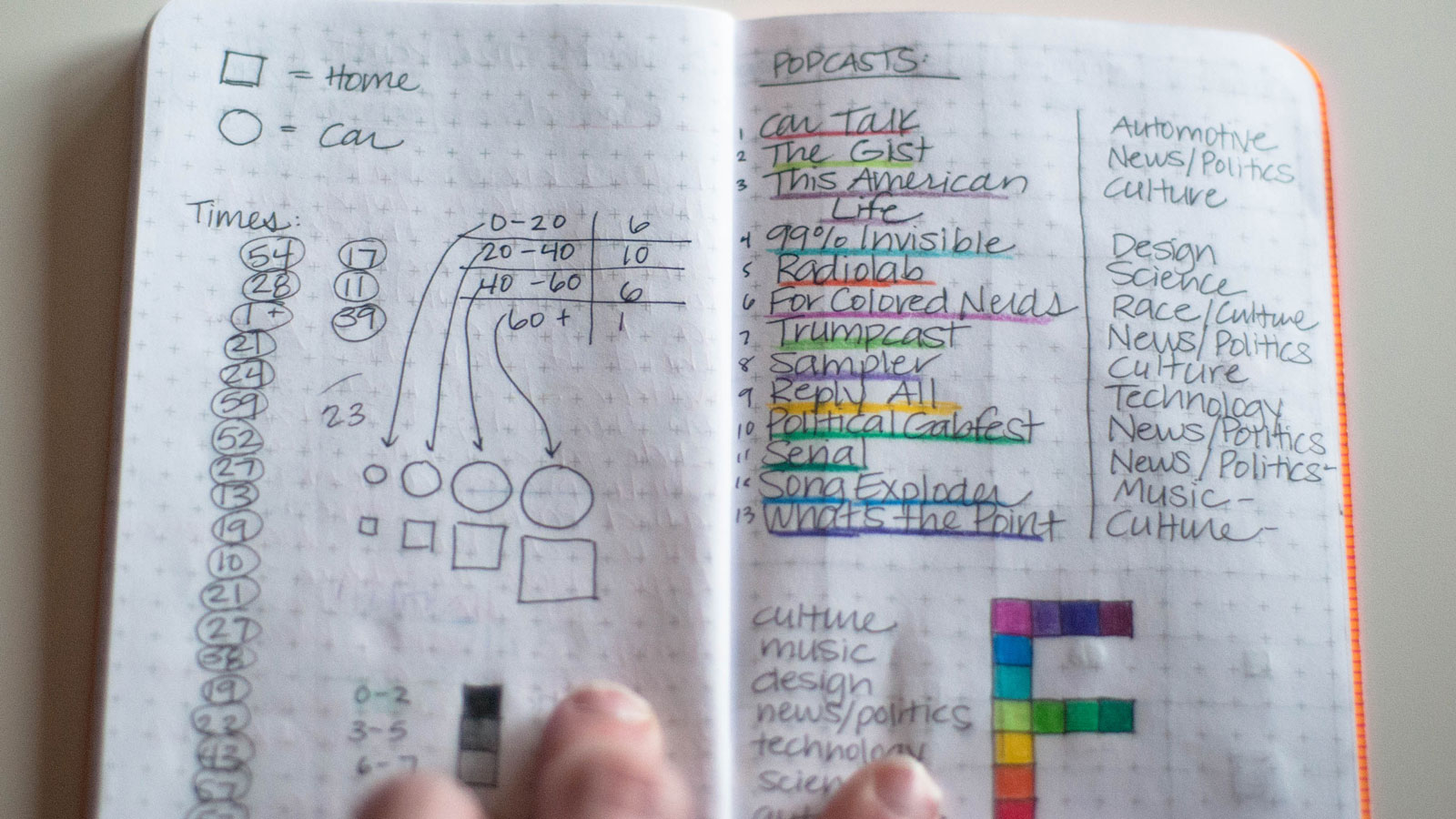
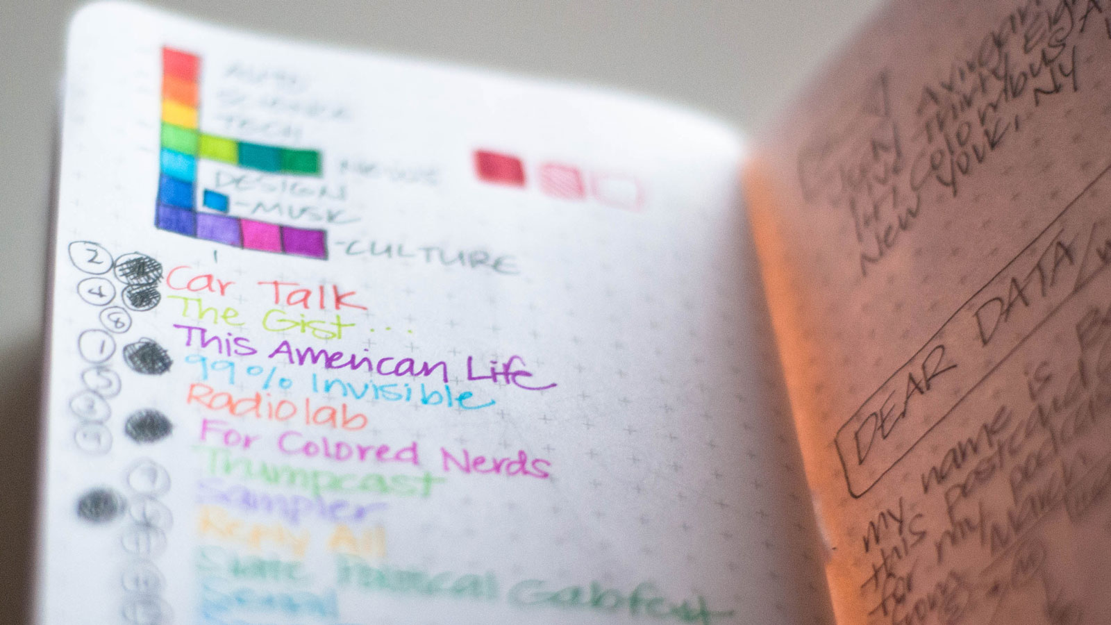
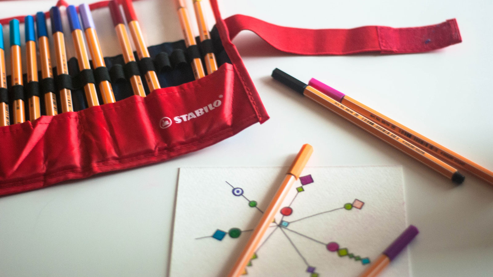
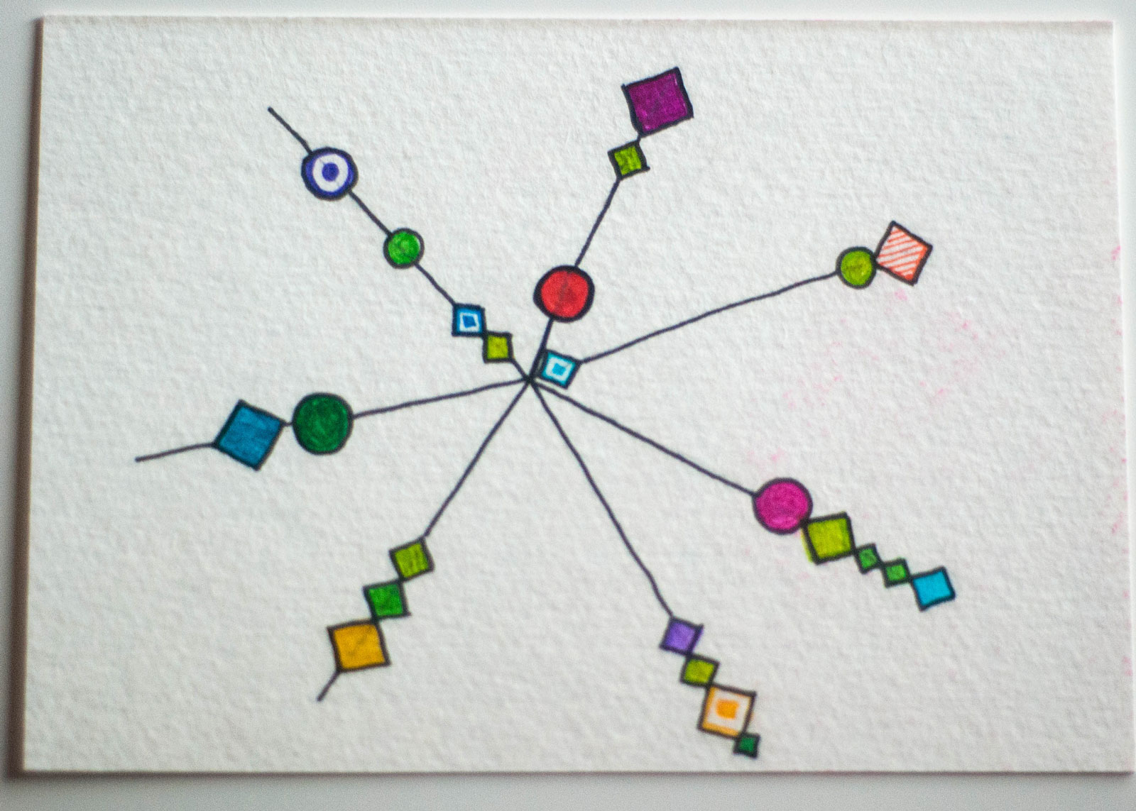
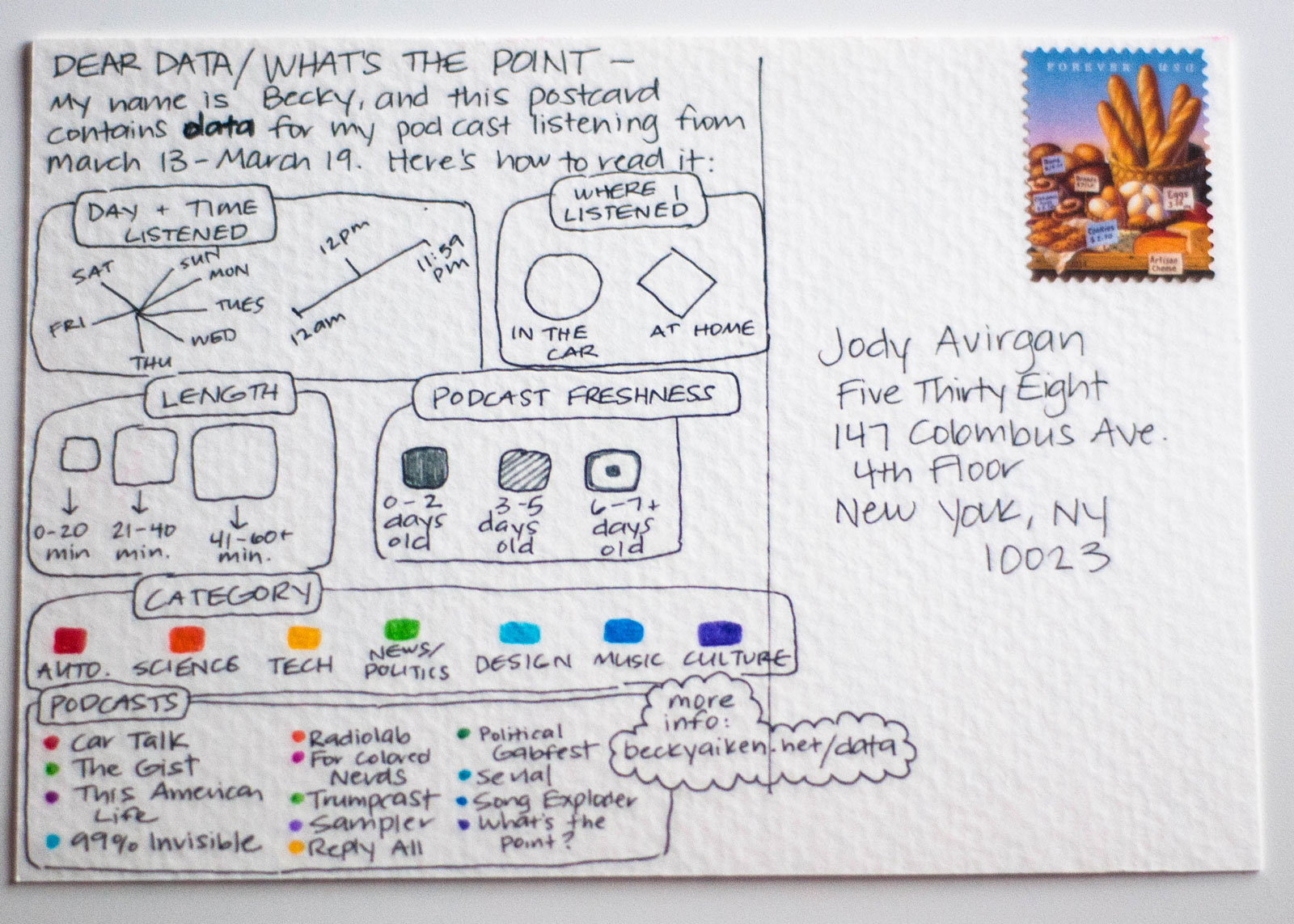
Jody Avirgan of the FiveThirtyEight blog “What’s the Point” partnered with the two ladies of Dear Data and invited podcast listeners to take a crack at hand drawn data visualization, and create a Dear Data-esque postcard for a week of podcast listening during the month of March. Below are some pictures of my process and the final result.